Airline Website

timeline
2024
My Role
UX Designer
category
ux design

Problem

The current booking process on airline websites is often impaired by usability issues, from difficulties in finding relevant flight options to a bumpy checkout process. In order to create a friction-free and user-friendly booking experience, it is essential to address these common usability issues and design a booking route that streamlines the flight search and booking process from start to finish.
Users

The target group of the Discovery Air (fictional Airline) website is primarily leisure travelers who plan their next vacation. A minority of users will visit the website to plan their business trip. So the user experience needs to be optimized for a broad spectrum of users planning different types of travel and therefore value on different search criteria.

Research

Benchmarking

I was focussing on the comparison of the booking process, starting from the homepage right through to the booking summary. The websites I have  investigated are Lufthansa as a scheduled airline, EasyJet as a low cost airline, Eurowings as a charter airline and Skyscanner as wildcard, being a flight booking platform.

As a result I found a whole lot of common patterns to be adopted, such as a prominently positioned search mask on the homepage with a small number of input fields to start with, allowing a smooth navigation through the booking process by a progress bar and showing more details on demand without overloading the surface. A location-based population of  the departure  airport field and providing the option to skip optional steps turn out to be best practice.

Paint points have been missing navigation patterns such as a progress bar and ‘Back’ buttons. The date picker solutions are not entirely intuitive: once a specific date is selected, it can be difficult to reset.

Online Survey

To give more weight to the user’s perspective I conducted an online survey, again focussing on the booking process. Research goals have been: Which are the crucial factors for people’s booking decisions and how can a flight booking website improve to serve the user’s needs?

I set up a Google form with 10 questions and 1 optional conditional logic question in addition containing a catalog of six closed and five open-ended questions.

It turned out that more research needs to be conducted especially concerning the multiple factors being  crucial for the booking  decision such as cost, departure time, transfer time and connection and how their weighting is. One of the most important pain points was a confusing display of flight options with limited or missing filtering options.

User Testing

A remote user testing via Zoom has been conducted, asking the test user to perform a flight booking from Hannover to Malaga for a set date and time period on 1) the Lufthansa Website and 2) the EasyJet website. Besides the usability tests the user has been interviewed on his traveling habits. Even though having very different user interfaces, neither Lufthansa nor EasyJet seem to provide a well structured, entirely intuitive booking process: Certain relevant search criteria such as selecting a specific airport for changing planes don’t seem to be selectable and the overall experience doesn’t seem to be friction-free and satisfying.

Analysis

Affinity Diagram

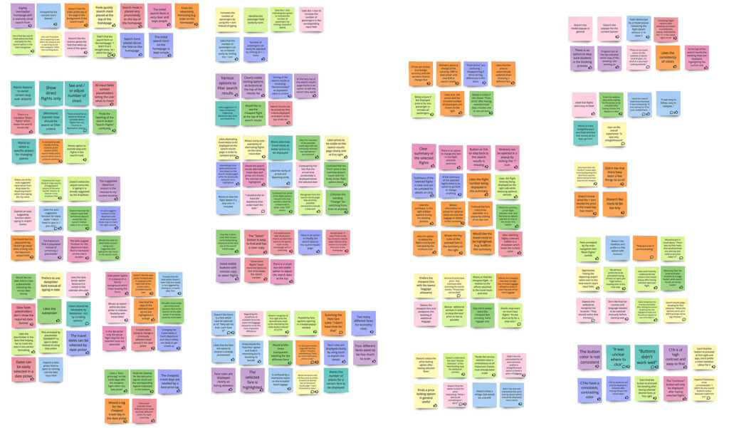
Afterwards, in the analysis phase, the results of the different research methods have been gathered and grouped in an affinity diagram which turned out to be very helpful evaluating mental models and pain points. Therefore, I set up a Miro board and gathered insights from all research methods – one per post-it.

The most common pain points have been the absence of an option to exclude stopover flights in the search mask, missing placeholders for the required date format in the date pickers, the lack of an autofill function for the departure field, and the lack of transparency about whether the total price is per person.

Customer Journey Map

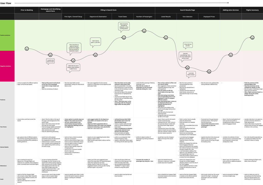
Based on the affinity diagram I created a customer journey map to visualize the touch points of the average user during the flight booking process and thus to point out the most relevant pain points. 

I set up a second Miro board and visualized the pain points and positive interactions, supported by observations of positives, pain points, mental models, behaviors and goals. To sum it up, the most difficult and friction-loaded touch points are during fare selection and displaying prices.

Design

User Flow

In the first step of the design phase, I designed the user flow for the “happy path”, the flow of a user walking straight away from search to booking without encountering any errors during his journey. I set up a Miro board to display screens, screen states and the connecting decisions and interactions.

Screen Sketches 

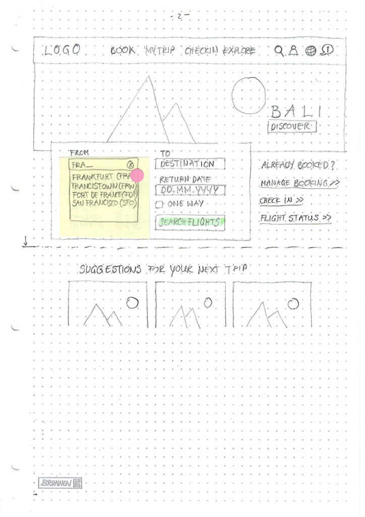
Using the user flow as a scheme, I drew up screen sketches with pen and paper to visualize my ideas of the structure for every single screen and screen state  during the process. Regarding the pain points identified during the research phase, I focused on ensuring intuitive navigation through a progress bar and ‚Back‘ buttons, an intuitive date picker allowing to change dates, and clear communication of price details.

To be honest, I was skeptical at first towards the analog paperwork. But afterwards, I am convinced of its benefits: Using pen and paper allowed me to draft a layout roughly without having to consider all the details.

A dotted college block turned out to work best using its grid as a guideline. Pencil and rubber helped me to quickly visualize ideas, being able to just as quickly revise and adjust them. The pinkish sticky dots stand for the users’ clicks, taking him from one sketch to the next according to the predefined flow. Working with real text all the way through helped to keep the flow on track.

Prototyping

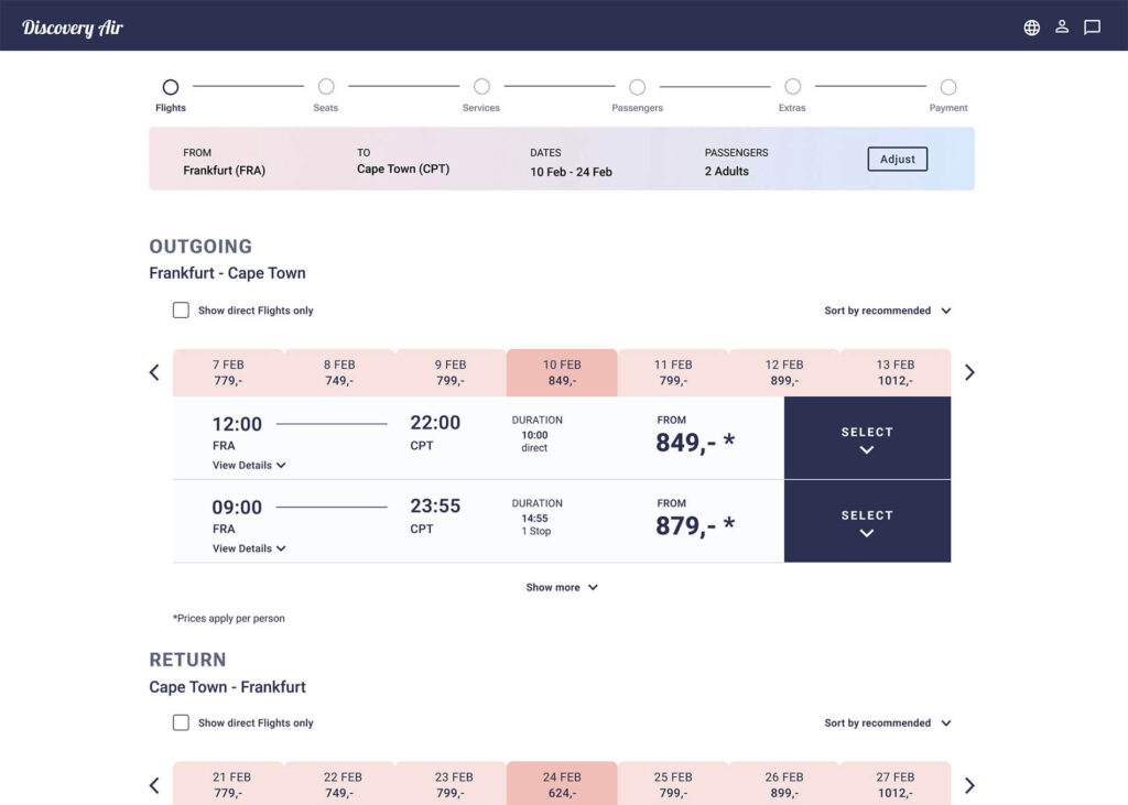
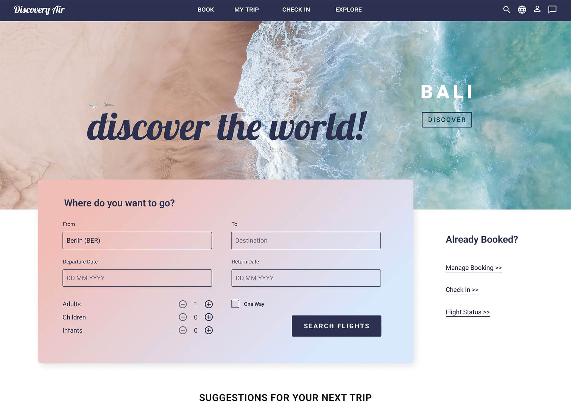
Taking the screen sketches as a blueprint, I started designing a medium fidelity prototype in Figma which seems to provide the appropriate depth of detail for the booking route as part of the website to be tested with users. Using the color gradient to rise a sense of flying into the sky causes a feeling of vacation is starting with the booking process. The cold-warm contrast of buttons and backgrounds makes call to actions stand out sufficiently.

Link to interactive prototype

By highlighting primary call to actions, setting concise button copies, offering filter options and providing more detailed information on demand (e.g. by unfolding a flight option and thus displaying more detailed information) I tried to create an ideally, friction-free flow through the booking process.

Eventually, I added annotations for the handover to the developers: I used the built-in comment function of Figma which provides an easy way to communicate with the developers in case of questions or insecurities.

Result and Prospects

To figure out if the solution solves the predefined problems of cluttered fare options and according prices comprehensively, needs to be evaluated by further user testing, which will set the iterative part of the UX process in motion.